UX Studies at Adriel
Role
UX Research and Planning
Worked for
Adriel
UX Research and Planning
Worked for
Adriel
April - July 2021
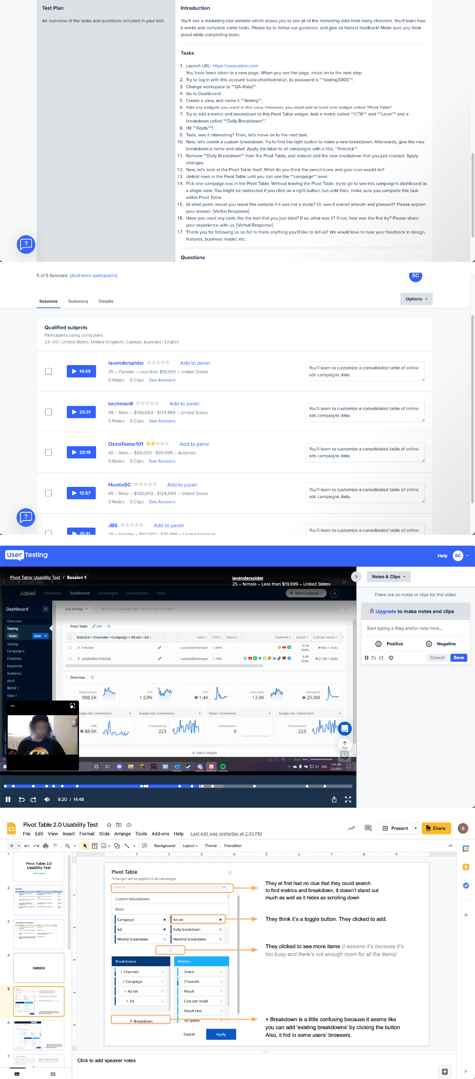
01 Pivot Table Usability Test
There are two types of products at Adriel. One is Adriel as a marketing agency, and the other is a marketing dashboard product where the user can track down marketing performance and all the data at one sight like Tableau and Klipfolio. The dashboard allows the user to adjust graphs and charts with the Pivot Table function on Dashboard.
I conducted virtual usability testing to learn where cold users were likely to see difficulties when using the product. The goal of the study was to make plans to tackle the difficulties and findings.
I conducted virtual usability testing to learn where cold users were likely to see difficulties when using the product. The goal of the study was to make plans to tackle the difficulties and findings.
아드리엘에는 두 가지 형태의 서비스가 존재합니다. 하나는 마케팅 에이전시로서의 아드리엘이며, 다른 하나는 광고 데이터를 수집 및 분석하여 보여주는 대쉬보드Dashboard 서비스로서의 아드리엘입니다 - Tableau, Klipfolio와 비슷한 서비스. 유저는 대쉬보드에서 자유롭게 테이블을 구성할 수 있도록 하는 피봇 테이블Pivot Table이라는 기능을 통해 데이터를 정리합니다.
피봇 테이블 기능이 얼마나 직관적인지를 확인하고 어디서 유저가 곤란함을 겪는지를 확인하기 위해서 원격 사용성 테스트를 진행했습니다. 궁극적으로는 이로 얻은 피드백을 실행가능한 플랜으로까지 발전시키는 것이었습니다.
피봇 테이블 기능이 얼마나 직관적인지를 확인하고 어디서 유저가 곤란함을 겪는지를 확인하기 위해서 원격 사용성 테스트를 진행했습니다. 궁극적으로는 이로 얻은 피드백을 실행가능한 플랜으로까지 발전시키는 것이었습니다.

▲ As-is
How actually Dashboard looked in 16-inch MacBook in May, 2021 (Pivot Table 2.0). Sensitive information is blurred.
How actually Dashboard looked in 16-inch MacBook in May, 2021 (Pivot Table 2.0). Sensitive information is blurred.
How I planned this testing
This study was run on User Testing, a virtual usability testing platform, and the reasons why I chose this platform were the followings:
For the reasons above, I chose the platform, set the instuctions, tasks and plan the all the part of the testing. After the testing, I analyzed the video and feedback and my team created issues and tasks to tackle based on the findings.
This study was run on User Testing, a virtual usability testing platform, and the reasons why I chose this platform were the followings:
A. At this point, the targeted market was English-speaking countries - particularly America.
B. With screen questionnaires and audience settings, User Testing allows me to recruit only within the targeted demographic group.
C. In-depth research was most proper and needed given that the product was actually successful and stabilized. On User Testing, I could let the testers experience the product following the instructions and watch the process.
For the reasons above, I chose the platform, set the instuctions, tasks and plan the all the part of the testing. After the testing, I analyzed the video and feedback and my team created issues and tasks to tackle based on the findings.
02 UX Improvement in Welcome
Adriel used Hotjar to watch user journey. I had a chance to look into how users reacted in the ‘sign-in and onboarding’ phase.
In welcome, it tried to lead users to sign-up with email > email verification > onboarding. However, I had found an error in UX planning in this step. This was that when they successfully verified their email, onboarding suddenly disturbed and users did not come back at a high chance.
After finding this pattern, I went through a lot of videos to find this pattern. I made a suggestion to tackle this problem and improved user experience.
아드리엘에서는 사용자 관찰을 위해서 핫자Hotjar를 사용하고 있습니다. 이를 통해서 웰컴 및 온보딩 단계에서 혹시 문제 될 것이 있는지 살펴볼 기회를 가졌고, 수십개의 영상을 모두 보면서 어떠한, 특정한 구간에서 이탈하는가를 확인했습니다. 웰컴 단계에선 간단히 이메일을 통한 사인업 > 이메일 인증 > 이후의 온보딩 으로 진행되나, 이메일 인증을 하는 경우 온보딩이 완전히 끊기고 해당 유저는 높은 확률로 돌아오지 않는 패턴을 보게 되었습니다.
이 패턴을 발견 후 동일한 현상을 찾기 위해서 많은 영상을 거쳤고, 이를 통해서 이메일 인증을 하더라도 온보딩이 유지되어야함을 인지하여 기획 및 개발단계에서의 수정을 이끌어냈습니다.
이 패턴을 발견 후 동일한 현상을 찾기 위해서 많은 영상을 거쳤고, 이를 통해서 이메일 인증을 하더라도 온보딩이 유지되어야함을 인지하여 기획 및 개발단계에서의 수정을 이끌어냈습니다.


03 Dashboard Improvement:
Demographic Data Visualization
The existing Audience section was made of only tables, which was very uncomfortable for users to check the audience tracking information. To tackle this issue, I made a suggestion on it.
당시 어디언스 정보를 보여주는 대쉬보드에서는 지나치게 표로만 구성되어 있어 유저가 정보를 한 눈에 보기가 어려웠습니다. 이를 개선하기 위해서 제작한 디자인 스케치를 제작하였습니다.

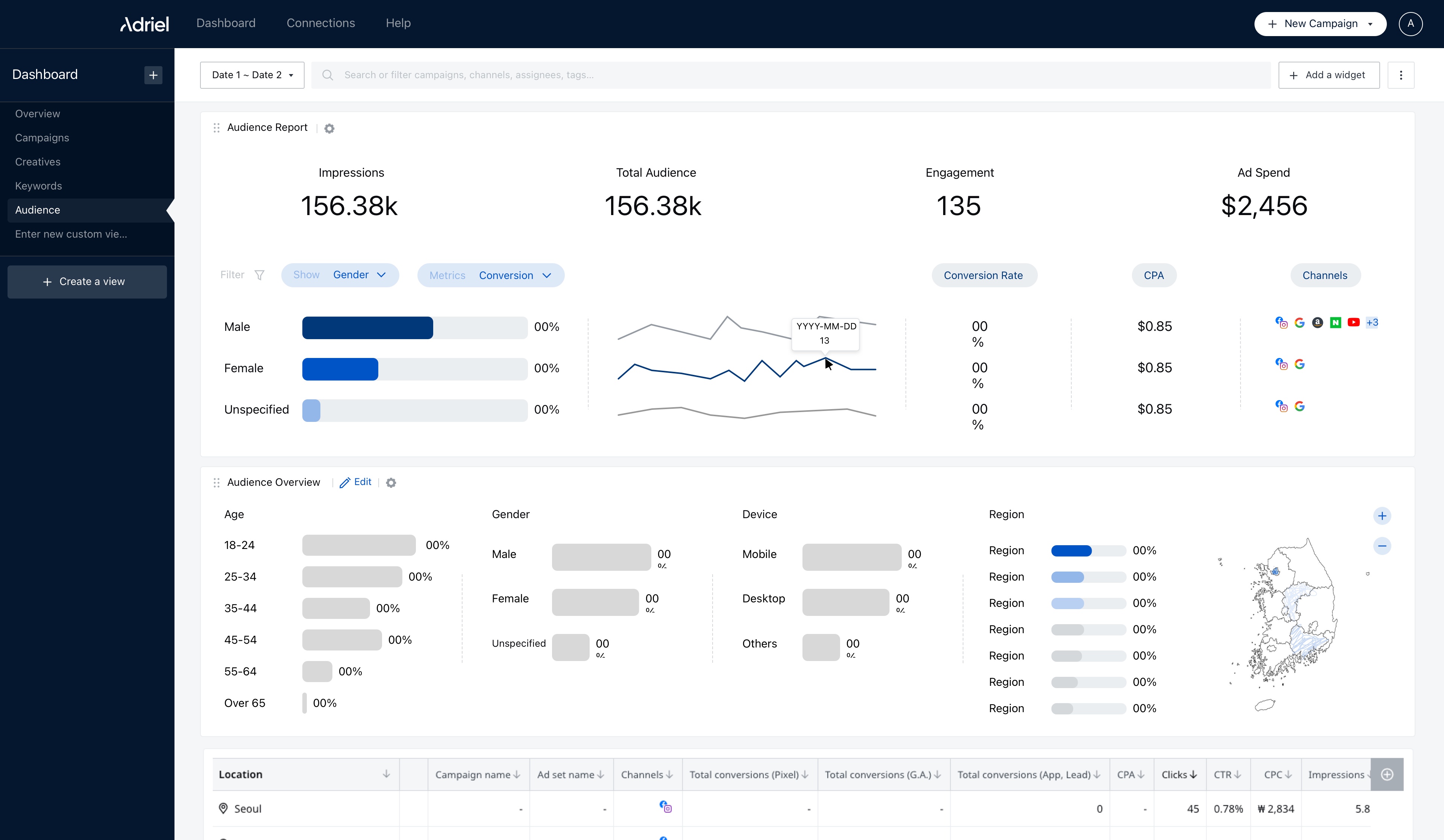

▲ As-is (1st) & To-be (2nd & 3nd)
Aside from the works above, I did:
Aside from the works above, I did:
A. Internal mobile app usability testing
B. Consistency in UX wiriting
C. UI/UX suggestions to tackle misleading UI problems
D. UI/UX suggestions
Article
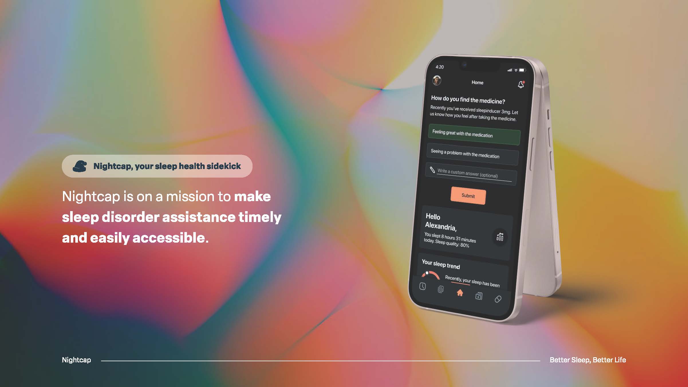
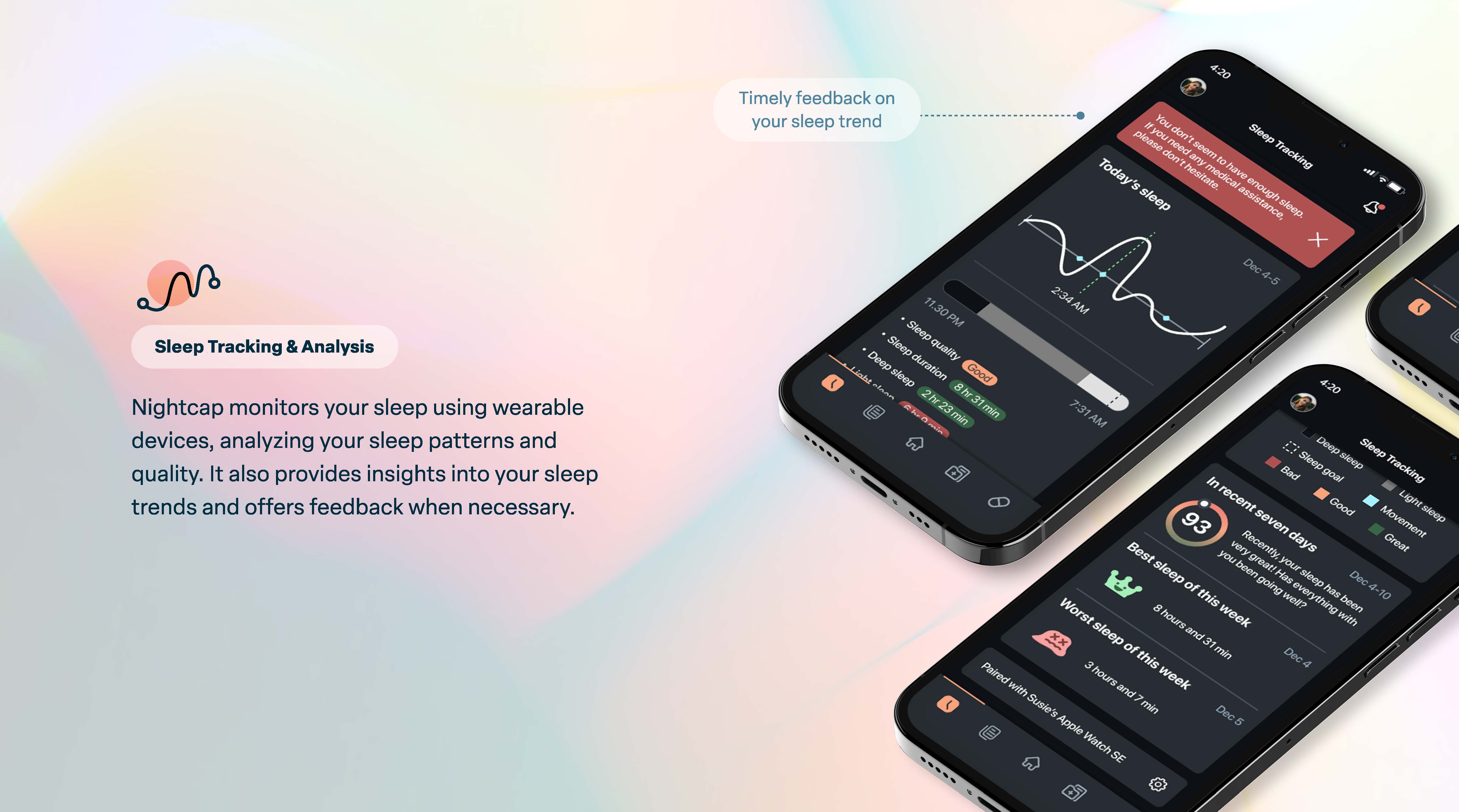
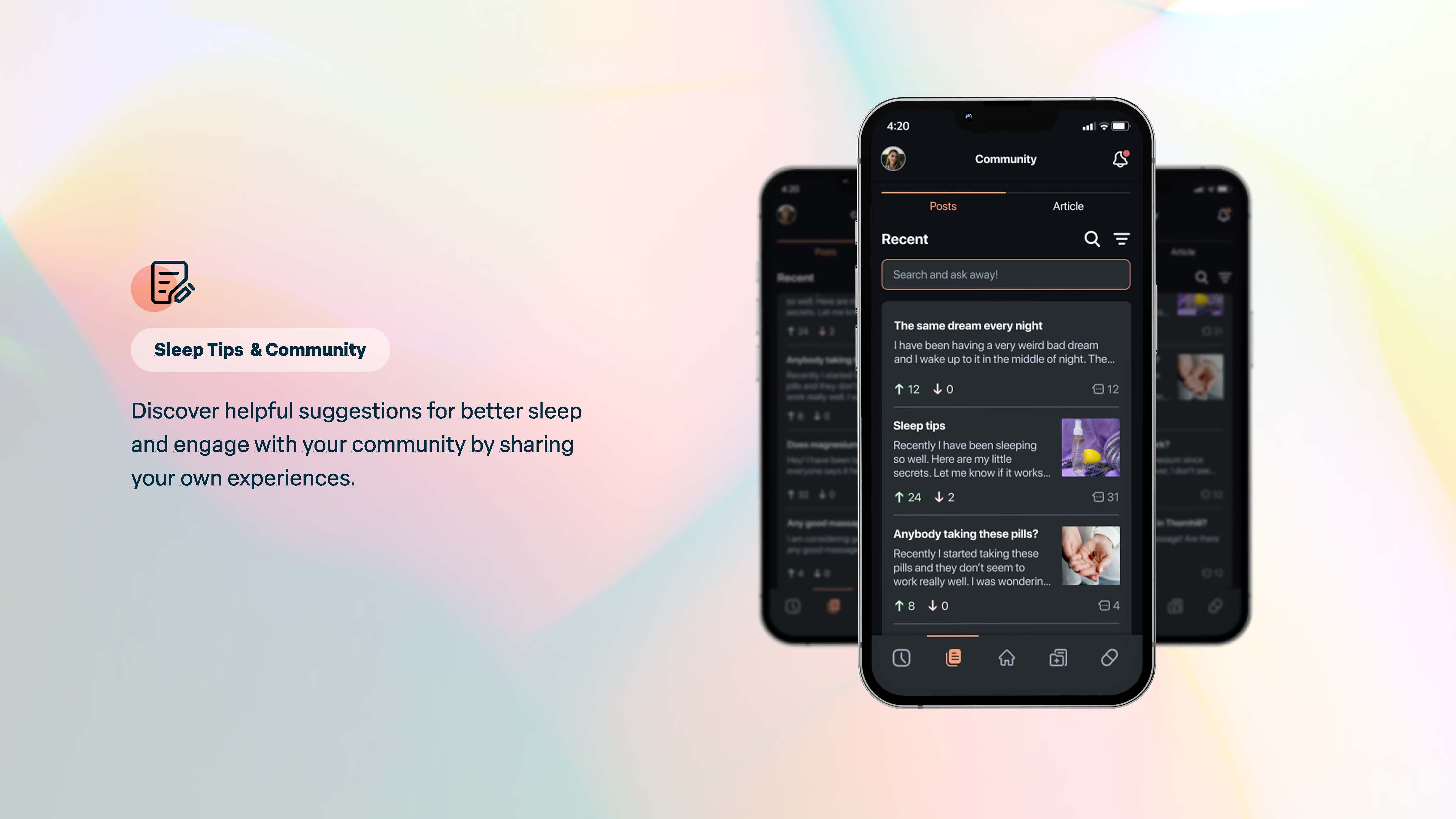
Nightcap
Nightcap is a service where the user can have timely medical access for their sleep disorders. I directed from branding to the final hi-fi for this project. To see the design journey, please check the articles below.
Article 01 - Nightcap: Better Sleep, Better LifeArticle 02 - Nightcap: Mobile App Design Project
Article 01 - Nightcap: Better Sleep, Better LifeArticle 02 - Nightcap: Mobile App Design Project


SUJIN SUSIE CHOI UI/UX & PRODUCT DESIGNER
TORONTO, ON, CANADA
TORONTO, ON, CANADA